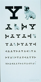


Paul Rand, (designed the logo for abc) among other work, created two pieces involving eye charts that I found were very interesting. The first is the Blurred Eye Chart and the second (1988) was a recruitment poster for Yale University. I believe that both examples relate to Visual Communication and Typography. These designs show both repetition to create balance with the letterforms and continuation as both ask your eyes to move down through the piece. Scale, symmetry and proximity are also very important components of the eye chart as the letters are sized and placed near or in correspondence to each other in both compositions.
The last photo is an photo of design I pass every day on my way to school. It is an example of the design principle of alignment as well as positive/negative with the shape cut out on the top right of the green square showing the brown underneath.

No comments:
Post a Comment