Catharine Fishel states in
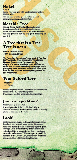
Designing for Children that effective design for children delights, informs, and satisfies while it does not look cute, pontificate, operate on preconceptions or lack content. Children will always be able to recognize marketing and if they are being sold. She also informs the viewer that children enjoy exploring through touching, smelling, tasting and feeling as well as their need to make their own contributions to the design. They enjoy a world of imagination and pretend play as well as doing things by themselves. A design should reinforce their own ability to succeed by providing challenges that can be solved. Many prefer bright colors with high contrast that create patterns or routine that is recognizable. In my final design, I made use of bright color that allows the child to become immersed in an almost imaginative world. In that, they have the ability to find the sculptures based on a recognizable form without the use of text. This allows them solve the map by giving visual prompts through the use of hierarchy and directional clues.
John Krygier expands on the fact that creating a successful map is the marriage of "rife with rules". This is based on principles that guide the user and informing them on how to understand it. This should first, be tailored for the audience (in this case, 6-8 year olds) and asks what they essentially want to gain from the map. The less important things should compliement the more important parts. This occurs through the harmony of each part with proper hierarchy for those aspects that are of great importance. In my map, the child only needs to find the five major sculptures as well as the activities. I used consistency of visual information to set up a system that allows them to recognize important points through hierarchy while maintaining their ability to hunt for the other information contained in it. Although simplicity was not a large part of my final map, Krygier states that "Its not what you put in that makes a great map, but what you take out." Due to the young age and short attention span of my users, my map involves an experience in itself and is not necessarily about the clarity of information. In my case, "more is more" to a certain extent. He goes on to say that map design should be functional and one should be able to gain use from a map at a glance. This informs the use of hierarchy to bring out those important aspects of the map and make sure that they are what the viewer sees first. My map uses emotion to engage emotion. "The image is the message...only when the reader engages the motion, the desire, will they be receptive to the map's message." Hopefully, the final design engages the user in such a way that they enjoy the process of searching the map as well as the sculpture park.
In,
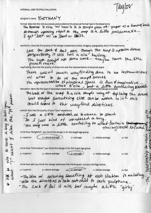
Play as Research, Eric Zimmerman outlines the importance of design research in creating informed solutions. Delight in a design can be achieved, not just with aesthetic qualities, but also in the interaction it creates with the viewer. Iteration that prototypes, tests, analyzes and refines the work is a part of finding the right solution. Feedback plays a crucial role in this. Clarify exactly what you want to test and why based on the purpose of the artifact and the needs of the user with each new prototype adjusting to something that had lacked in the previous experience. This process itself, is a form of design research and is one of the most successful in blending the designer and user. It was interesting to note the behavior of the children using my map. They were immediately engaged with the aesthetics but had a hard time identifying their actual location. In that, I was able to adjust and modify certain points of the information to, hopefully, allow for a successful combination of lost and found.


 These ideas were developed into proposals that chose specific channels and organizations and rough copy that would be used. This also included the first round of sketches.
 The next step was to expand on the idea of repairing the torn seams by brainstorm sketching different copuwriting as well as imagery and channels that could be used with the same idea.
 At this point, the idea was put into a rough, digital storyboard that outlined the basic copy and motion.
 This storyboard was refined with added textures, colors and sequences.
 From the storyboards, the piece was taken directly into after effects and developed in motion.
 Each sequence was evaluated and refined into the final piece. For example: the closet sequence did not bring a reference to the graphic quality of the human icons was not found in the closet sequence, the use of the scissors in the word torn was illegible, and the handwritten copy developed into the use of a digital typeface that complimented the quality of the sequence.