

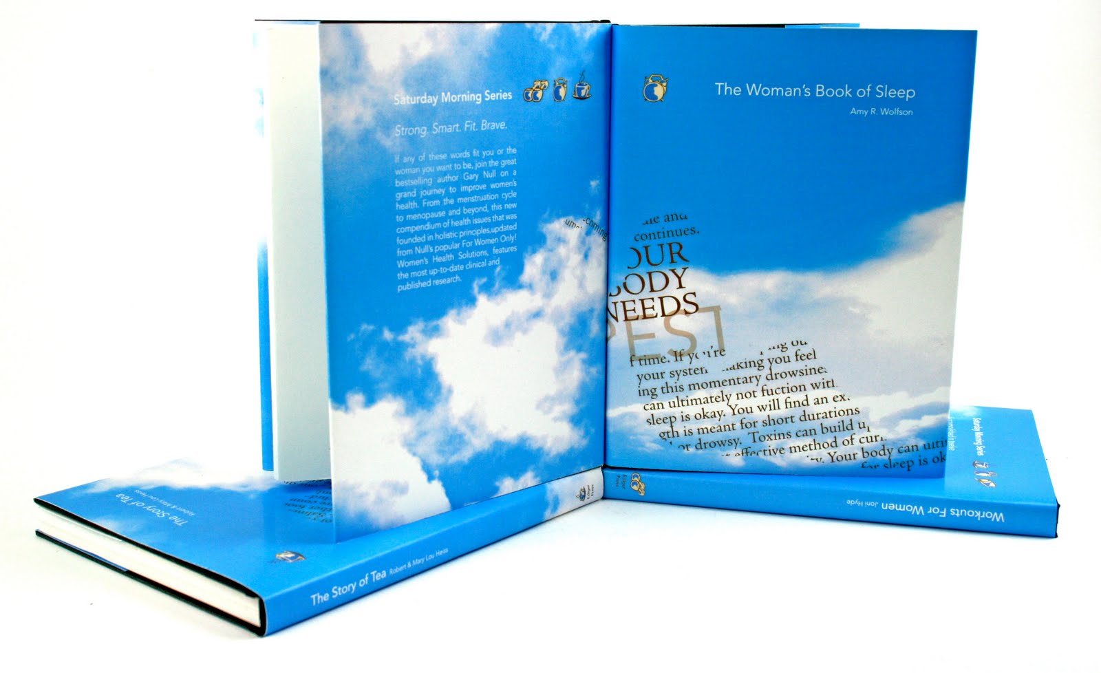


Each of the book represents helpful, non-fiction readings written with activities of a woman in mind. On the jackets, I chose to place different views of a cloudy sky to emphasis the light and cheerful aesthetic of a good morning. This is can be seen in a gradation from cloudy to non-cloudy sky when the series is seen together. I tried to choose a sky that corresponded with the theme of each of the books and activities that I felt looked like might happen on those days. The text is very simple, a light Avenir, and seen in white. The horizontal band of icons is seen in line with both the title of the series and book title with the icon that corresponds with the book on the front cover. The female form is placed in the lower left hand corner with text that gives a glimpse at what one would read inside the book. Legibility of the female form is still debatable. I've asked different people for their opinion and the majority have told me they recognize the form and the activity, but almost everyone had a different answer when asked the most/least legible. Also, I was a little wary that the text in the forms would be too distracting from the title or backside text. Prehaps more abstraction (or size adjustment) of the type in the forms would have helped make each look more like an image rather than more text. The density of the text in these forms became really important so that the viewer would be able to see the form itself. I am still caught in a bit of confusion as to what I should do with the female figures. Because these are book covers, I think it is good if the form isn't as immediate as it would be on a poster. It is okay to let the viewer investigate and then then recognize.
The project as a whole was good for me to work through and learn from. I was really excited about it after the first round of printed iterations because I felt like I had a good direction to explore. The parameters of the assignment (aka duotone, etc...) kind of toned-down my vigor for some, ungrounded reason. I thought this was really good for me to learn from though because if were to design an actual jacket for a real book, there would be parameters that I wouldn't neccesarily want to do. It was also good for me to learn what the average person (if there is someone like that) would assume they want to see on the cover of a book in the areas of literacy and/or redundancy. I gathered conflicting opinions.


Concept and Execution: (process also seen in previous posts)


No comments:
Post a Comment