
The poster shown in last critique needed a lot of improvement:

I looked to this Bantjes piece for inspiration:  Made multiple patterns from ink marks and added color (this was fun):

My old design was too closed and symmetrical so I drew a new design:


The salmon color is too fleshy:
 Made multiple patterns from ink marks and added color (this was fun):
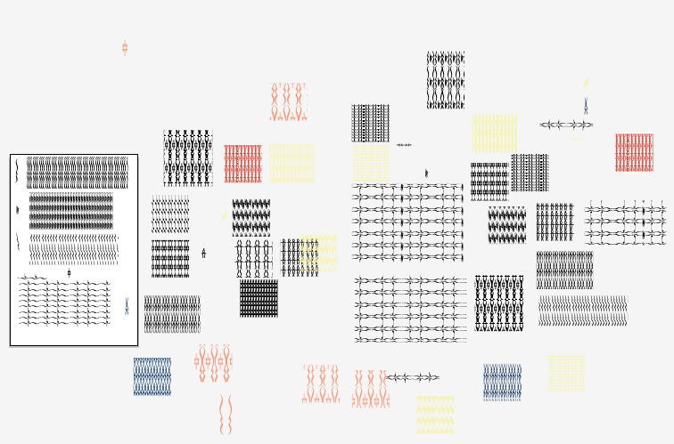
My old design was too closed and symmetrical so I drew a new design:


The salmon color is too fleshy:

Working on color and the relationship between text and line/pattern:

No comments:
Post a Comment