Final Review List:
Visual Communications:
Books: Dot, Line (Print out specific juxtapositions?), Haiku Taxonomy, Info-graphic Spread (Print out separate info-graphics?), Museum Exhibit
Animation: Haiku
Process: Haiku/Taxonomy, Icon Set (Info-graphic/Museum Exhibit)
Print: Line Juxtapositions, Info-Graphics [?]
Typography:
Print: Monogram Layout, Change One Thing Poster, Weather Billboards, Magazine Layout, Marian Bantjes Poster
Animation: Weather
Process: Weather (Type Experimentation Photographs), Change One Thing Poster
Color, Drawing & Form:
Books: Color Book (Shoe Photographs)
Image Making:
Books: 7 Deadly Sins
Print: Amelia Earhart Poster, 6 Degree Poster & DVD set (shared with Brandon)Other Project Possibilities:
Color, Drawing & Form: "X" Manipulated Letter-form?
Image Making: Book Covers?
Type:Process on Magazine Layouts?
First Direction:
Express my interest in typography as well as print work that communicates through specific audiences (Using my magazine layouts and posters) as well as a brief interest in photography and experimentation (using my color book, deadly sins book and weather billboards).
________________
Second Direction:
I would like to discuss my interest in typography, pattern and concept.
Typography will be referenced in my magazine layouts and Change One Thing poster. The Change One Thing poster will include process from initial concept with the AIGA competition to the poster shown in the Steve Frykholm critique and then the final submitted and spread throughout Kansas City (shown in context). Spreading across classes with my magazine spreads, I will discuss how I handled typography within my info-graphics as well as the line book from first semester.
Pattern will be included through an overview of my Line book from first semester (with selected juxtapositions printed larger and hung on the wall) in addition to the recent Museum Exhibit and Marian Banjtes Poster. Within this I will talk about the formal qualities of including pattern and how it relates to images and text within a composition as well as conceptual levels within both the exhibit and line compositions that used principles (like anchorage and relay) to create deeper meaning in specific compositions that compliment my design.
My last subject will include a brief overview of the conceptual base for many of my projects shown specifically through my color and 7 deadly sins books. How I am influenced in photography and how I have learned from the process of creating specific compositions rather than arbitrary photographs that can form relationships to type and other design elements.
Edit & Print:
Change One Thing Poster
Magazine Layouts
Information Graphics
Line Book (one)
Specific juxtaposition compositions
Museum Exhibit Booklets and Materials
Things to include during my presentation:
What I have learned spread across classes and semesters
"For example..."
Dot Book Line Book
 Haiku Taxonomy (Include Process)


 Haiku Animation
 Info-graphic Spread (Include Icon Process)


 Museum Exhibit (Include Icon Process)

 Monogram Layout
 Change One Thing Poster (Include Process)


 Weather Billboards/Animation (Include Process of Experimentation Photography)

 Magazine Layout
 Marian Bantjes Poster
 Color Book
 7 Deadly Sins
 Amelia Earhart Poster
 6 Degree Poster & DVD


After watching the movie " 6 Degrees Could Change The World" I was really interested in focusing on specific aspects in each degree. After discussing and "concepting" with Brandon we developed a plan for communicating each level that involved both photography and the creation of a vectored object through the combination of circular elements from the movie (i.e. hamburger bun, wind turbine, wheel, etc...). This would then be placed over images that illustrate the importance of each level based on the transparency of the photography. After a lot of sketches, Brandon and I made a few digital versions that included all of the elements including the "close-up" photography of a specific concept from each level. However, because of the detailed photographs and their combination with the vectored circular object (as well as class critique) we decided that our idea needed to be adjusted, both in composition and by adding an element that seemed to be absent. From this point, we agreed on the importance of the CO2 based on its frequent reference in the movie. We chose to use this as an added element across all of our materials and change our direction almost completely.
With our new direction the still images were placed and shot to communicate with the viewer on a close up, personal level to hopefully connect with the viewer in a different way (not just a picture of the earth, nature, etc...). Conceptually, each photograph illustrates a certain point that seemed to be the most dominant in each degree shown in the movie (Ex/ 1st Degree = fire). Formally, the images were placed within the molecule and arranged by both composition and color. Moving images within the animation kept the same quality but were manipulated by moving the images in motions that corresponded with the photograph. The images were placed in the molecule, not only formally, but also to show how each degree is influenced by CO2 which was then placed over the chosen industrial background image to give the viewer context in an environment as well as the blue color. Using the 6 as more of a design element (which, based on critique, may not have been the best choice due to illegibility) we aligned the text simply and on the right because we felt that the imagery and other elements were more important. The poster included text with useful tips that are practical for the average person (some were taken from the original case's inside as well as other found tips). These were included to support the idea of personal involvement and promoting the movie in concept as well as filling the requirement to include text from the original DVD cover.
The animation left a lot to be desired. We initially began with ambitious ideas that could have been fulfilled with more knowledge of action script and flash (which both Brandon and I were lacking). Because of this, it wasn't as cohesive as it should have been with the other materials. In addition to this, the moving images should have been more emotionally moving and not seem like they were arbitrarily placed within a box and adjusted. However, the movement of the molecule was a nice addition to our theme and used our new knowledge of how to create buttons in Flash.
I felt like the inclusion of the molecule was a good choice and hopefully it corresponded well with the photographs. I really enjoyed the photography part of the process (as usual) and found that taking one element of each degree that Brandon and I had decided on in class and emphasizing it worked well. Using water as the only the stock image and thanks to my willing models, I was able to achieve most of the photographs I had in mind.  Version of Original Poster Idea:
 Version of Original CD Cover Idea:
Circular Vectored Object: Original Concept Sketches:
Human Conflict:

Ice:
(I have quite a few of these. This is a different one than I showed in class)
Fire:
(merged images)
Death:
 Photographs of scenes to illustrate elements of different degrees from the movie.
___________
First integration attempt:


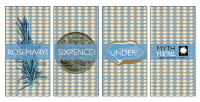 Monogram Layout


 Original Concept Sketches:

 Fire: (merged images)
 Photographs of scenes to illustrate elements of different degrees from the movie.

