Showing posts with label Typography. Show all posts

Monday, December 7, 2009

Candy Cane Bitmap


I chose to create my bitmap font using mini candy canes. My first two attempts proved unsuccessful (based on the feedback received in class) but I was encouraged to explore the third. This was primarily due to the fact that I set the baseline and x-height with room for the descender which I had overlooked in the first two. This particular font's baseline is two units from the bottom and the x-height is six. (I also altered the grid from 2" to 1.5" in order to close the space around the candy canes. I attempted to design the font while keeping in mind my object. I am unsure as to how successfully this was translated to the final letters, but the bitmap font as a whole undoubtedly gives off a holiday feel.

Monday, November 16, 2009

Web Layouts


Here are my corrected web layouts. I am still having some difficulty with different aspects of each of these. I adjusted the leading on all the text to attempt at making it more "readable" as well as changing the alignment and placement of the title as it relates to the monogram and image, however, I feel that there could be improvements but am unsure of the action I should take in order to achieve it. Also, I added two more that weren't in the group seen last week in class.

Sunday, November 8, 2009

Lead Layouts

After determining a finalized monogram, Typography 1 has focused primarily on layout design this past week in class. These designs incorporated all previous elements up to this point of the process. Taking the research paragraphs, properties list, title, image, monogram, element name and number, the first round of iterations began with a 57+ page Indesign study of my chosen typeface, Adobe Jenson Pro, considering size, tracking, and leading as they related to the text and each other. After this, the class was instructed to generate five layouts requiring hand arrangement of the necessary elements. From the class critique, the second and third round of iterations commenced until the three final layouts were chosen in consideration of hierarchy of text, paragraph arrangement and fluidity of each composition. From these three, we were to correct and choose our best layout in Indesign for inclusion in a final, 7.5" x 7.5" book published by lulu.com. (Shown: 3 Final Layouts)


Friday, October 23, 2009

Lead Pb


Lead Pb | 82

Title Options:

“Lead”ing

Caution! Lead Ahead

Lead in my bread?

Lead is thought to have been discovered and known by the ancient Romans. An exact date of discovery is unknown, although some sources believe it was in use before 6500 B.C. Supposedly, it was used to sweeten wine and much of the Roman diet as well as an aid in plumbing construction. The name originates from the Greek word protos (first) while the symbol is derived from the Latin word plumbum (lead). Lead is known as a “poor malleable (very soft) metal” with the symbol “Pb” and the atomic number of 82, placing it as the highest of all stable elements. According to most sources, it has a bluish-silver color when freshly cut that turns a dull gray when exposed to air and gives a chrome-silver luster in liquid form. It can be found in ore with zinc, silver and copper. Finding active lead is rare, however, the most common found lead form is known as galena.

Having a number of various uses, lead is seen in construction, batteries, weights, solder, shielding radiation, ammunition and, in some cases, gasoline. It also creates many valuable compounds such as those used in printing and painting. It is the end product of radioactive decay. As seen with lead poisoning, all forms of lead and its compounds are toxic (especially to children due to their rapid metabolism, smaller mass and habits). Health concerns and lead pollution are usually due to human activities and processes (e.g. exhausts on cars). In addition to this, lead can be dangerous and found in almost anything such as water, meats, grains, fruits, vegetables and soda to name a few.

Phase at Room Temperature: Solid

Element Classification: Metal

Melting point: 327. 6 C

Boiling Point 1740 C

Density 11.35g/cc @300K

Electrons: 82

Neutrons: 125

Atomic Number: 82

Atomic Mass: 207.2 amu

Crystal Structure: Cubic

Group: 14

Period: 6

Lustre: Metallic

Transparency: Opaque

Color: Grey—coated with white Hydrocerrusite

Hardness1 ½

Tenacity: Mallealble

Fracture: Hackly­­

Electron Configuration: 1s2 2s2p6 3s2p6d10 4s2p6d10f14 5s2p6d10 6s2p2


Friday, October 16, 2009

Periodically Speaking


Pb Research:

Lead was thought to be discovered and known by the ancient Romans. An exact date of discovery is unknown, although some sources believe it was in use before 6500 B.C. Supposedly, it was used to sweeten wine and much of the Roman diet as well as an aid in plumbing construction. The name originates from the Greek word protos (first) while the symbol is derived from the Latin word plumbum (lead). Lead is known as a “poor malleable (very soft) metal” with the symbol “Pb” and the atomic number of 82, placing it as the highest of all stable elements. According to most sources, it has a bluish-silver color when freshly cut that turns a dull gray when exposed to air and gives a chrome-silver luster in liquid form. It can be found in ore with zinc, silver and copper. Finding active lead is rare, however, the most common found lead form is known as galena.


Having a number of various uses, lead is seen in construction, batteries, weights, solder, shielding radiation, ammunition and, in some cases, gasoline. It also creates many valuable compounds such as those used in printing and painting. It is the end product of radioactive decay. As seen with lead poisoning, all forms of lead and its compounds are toxic (especially to children due to their rapid metabolism, smaller mass and habits). Health concerns and lead pollution are usually due to human activities and processes (e.g. exhausts on cars). In addition to this, lead can be dangerous and found in almost anything such as water, meats, grains, fruits, vegetables and soda to name a few.


Phase at Room Temperature: Solid

Element Classification: Metal

Melting point: 327. 6 C

Boiling Point 1740 C

Density 11.35g/cc @300K

Electrons: 82

Neutrons: 125

Atomic Number: 82

Atomic Mass: 207.2 amu

Crystal Structure: Cubic

Group: 14

Period: 6

Lustre: Metallic

Transparency: Opaque

Color: Grey—coated with white Hydrocerrusite

Hardness1 ½

Tenacity: Mallealble

Fracture: Hackly

Electron Configuration: 1s2 2s2p6 3s2p6d10 4s2p6d10f14 5s2p6d10 6s2p2

Typeface Choices:

Helvetica

Grotesque MT St

DIN Schriften

Adobe Jenson Pro

Chaparral Pro

Kepler St

F + S:

I thought this was kind of interesting:
www.themaninblue.com/experiment/BokehType/

More Related to Type:
http://www.typetester.org/
www.moorstation.org

Monday, October 12, 2009

Project Three: Narrative in Motion


Over the past few weeks in Type, the class has been creating narratives representing two ideas from a chosen letter and integrating them, with found imagery, into a Flash animation.First, we started by sketching out various compositions of the chosen letterforms. These sketches were then placed onto 3" x 3" cards to aid in the process of elimination. I chose to use Futura and Garamond due to their noticeable difference in stroke as well as being a san-serif compared with to a serif font.
After the initial compositions had been reviewed, I realized that many of my arrangements were entirely too cropped to be able to recognize the letterform. Because my chosen letter was a "b", I found it difficult to find appealing compositions while, at the same time, keeping legibility. In the second round, I worked on expanding upon the compositions I had already created and including more of the letterform. Within the next few rounds of iterations, I picked two of my best to start the sequences with.
After choosing the best compositions, our next assignment added imagery incorporating the words (shown in an earlier post; "b"rainstorm) starting with the letter "b". Creating four variations of different words and images, I chose bathroom--bacteria and bread--bacteria as my final two possibilities to create the narrative around.The class was then assigned to create a series of 9 sequences to document the transformation of our two typefaces (Futura and Garamond). I chose to base my narrative off the movement of the last sequence shown below not only due to the inclusion of my chosen compositions but also to because of the variety of motion of the letterform.
With the compositional work behind me, I began to explore Flash using techniques shown from the class demonstrations on masking, motion and shape tweens, as well scale, transparency, rotation and cropping. This was my first time even opening the program so it was definitely a challenge and I learned a lot. Specifically, save every few minutes! I had unexpected crashes more than a few times. Command > S will now be a regular habit.


Saturday, October 3, 2009

Preparation for Narrative in Letterform


Extending the "b"rainstorm from the post below, the class has begun to create sequences to prepare for our narrative animations of the chosen letterform. Choosing the best compositions based on dynamic use and balance of positive and negative space and letterform legibility,
we were instructed to add content through found imagery to the compositions by masking in illustrator, creating 4 variations for each. I played around with a few different ideas; bacteria/bandage, bacteria/bite, bacteria/bread/, bacteria/bloom, bacteria/bathroom, bulimia/ballet. Obviously, bacteria is my core word for the animation and, after the brief critique in class, I decided to possibly tell the narrative though the connection between bacteria, bread and bathroom.
(Shown: 8 sequences from Futura "b" to Garamond "b", 6 examples of content compositions, process photo including initial sketches and 3''x 3'' composition cards)

Friday, September 25, 2009

"b"rainstorm


bacteria | biology | blood
brute | bully | bruise | blood
branch | brussels
bulimic | bipolar
baby | birth | bottle
bulge | belly
bishop | baptize
brunette | blonde
book | bind
branch | brussels
budget | beggar
ballet | bow | bun
butterflies | breeze
butter | bowl
ball |bounce
bridge | bomb
balloons | bubbles
brother | boy
boy | bachelor
beauty | beast
baboon | bite
bug | beetle
book | bag
bell | band
bird | beak
banana | blueberry
bodice | bust
bicycle | breath
baby | bottle
bakery | bread
bud | bloom | bulb
bed | blanket


barbie
bamboo
blue
brown
babylon
broccoli
basilica
back
bad
bandage
bald
baltic
bandit
bar
baroque
bathroom
beach
battle
bend
bitter
blimp
boat

I was unsure of the specifications for gathering images but I collected a few online (shown above) that I found interesting. The bacteria would make great pattern.

Monday, September 21, 2009

Final Statement


mis|communication
Shown: 4 selected pages and cover

I was really excited as I was flipping through my process binder after finishing my book. I have enjoyed the short "stops" along the way as we have moved through the project to this final phase and found the view as a whole to be very satisfying . Although this assignment was approached on a number of different levels; type, image, communication, I first began with the conceptual aspect in class with "mind-mapping." Starting with the umbrella topic of family, I drew out around 4 maps until I arrived at "miscommunication." Specifically trying to portray the idea of miscommunication between two people as opposed to technical and other means of communication. This led to my 9 words pertaining to issues that involve miscommunication such as being elusive (not being able to express clearly) and disconnect (to detach). My theme sets the stage for an argument or a topic that is trying to be communicated, starting with a conflict and evolving into a serious issue. If one wanted to take the book even further it would lead to the causes of miscommunication and its effects of this in a human relationship (e.g. divorce, grudges etc...) Extending the concept and chosen words, I wanted to include images of human interaction, most of which occurs in two primary areas of the body; face, hands. I hope that, without the knowledge of the fact, one would be able to tell this was miscommunication of people in personal relationships rather than another form. Leading the viewer through the attitudes and actions of specific persons that make clear communication so difficult to achieve, I chose words such as ambiguity and impulsiveness to try and express the mannerisms that can end in miscommunication. I tried to relate this to actions or attitudes that I have experienced personally. Making an effort to consider what actually leads to miscommunication, I highlighted, in more ways than one, how humans don't often see eye to eye about specific issues and this difference can lead to miscommunication. I chose black and white with bits color to emphasis not only this contrast between specific people but also human aesthetics through flesh tones. I was beyond ecstatic to find a book of Braille to use as my background. Trying to communicate visually through this book with images and text obviously does nothing for someone who cannot see. Even though the actual Braille words aren't directly related to the book, it only serves to emphasis the theme of miscommunication. If a blind person were to try and read the book, not only would the text be interrupted by my images and transparencies, but the mixed pages and content would make no sense.

Combining the compositions was one of my favorite parts of the project. Having worked on both sets of 9 compositions individually, I found that many of them worked with their corresponding 9 serendipitously. I did have to go back and work with a few to make them work more cohesively with their partner but the general composition stayed relatively the same. I hope that through the combination of the text and image, the compositions are not only visually appealing but clearly communicate my theme to the viewer.

I learned a lot with this project not only about attention to craft and concept, but also how to work with my computer, the printers, and the use of found images, as opposed to creating my own. Using found images brought in an entirely different challenge for me into the project. I spent a large amount of time searching for the images and background. Half Price Books became my favorite store all over again. Bringing all these aspects into a solid, tangible form helped open my eyes to a few more possibilities of what I could have done and what I am able to do in the future.

As far as improvements go, I should have printed off my color photos onto a thicker paper. Even though I was careful to use a bone and press down the braille on my background paper, it is still visible through the paper and appears bumpy and looks poor. When I was erasing the leftover rubber cement from my dots, there were quite a few times when it would snag the end of my circles and give the edges an unclean appearance. Also, the punch I used to cut some of the 1/2'' (and smaller) circles gave some of the dots rough edges that were difficult to properly even out with an exacto knife. Extending my transparency compositions a bit further would have also helped for a cleaner end to some of the arrangements.

There is always room for further advancement and, in this project, it is visible. Despite this, I am fairly satisfied with the end product. I worked hard in the process and now, at the end of this first project, I have learned a lot and am close to content with the result.

Saturday, September 5, 2009

Perfect Painting

In order to first draw the "scaffolding" of my given Bodoni letterform, I determined the other dimensions of the letter by making the x-height 6" tall in order to enlarge my "r" by 200%. Drawing this out lightly on the final piece of bristol in pencil, I calculated each section of the letter (shown in the upside-down "r" photograph) and from the guide lines, connected the points and sketched the curves. From here, I filled in the sketch with black gouache, correcting mistakes with white gouache as needed to ensure proper angles and straight lines. I really enjoyed the precise nature of this assignment but found the more I worked with the white gouache the more mistakes (such as adding too much water paired with not enough drying time, resulting in gray) I ended up having to correct. After critique, I corrected the angle on the stem that appeared to be too exaggerated and then compared the finished "r" with a large printed version of my letterform. Much to my relief, it was almost exact!

Wednesday, September 2, 2009

Theme & Words | Part Two | Project One

Miscommunication
You & Me

Conversation Miscommunication

Relational Miscommunication

  1. Impulsive
  2. Disagree changed to Conflict
  3. Biased
  4. Disconnect
  5. Misrepresentation changed to Distort
  6. Elusive
  7. Mislead
  8. Indirect changed to Ambiguous
  9. Repress
I am considering other titles and different words but I wanted to narrow down the possibilities as much as possible today. I will continue to update the list until it is needed on Friday.

Tuesday, September 1, 2009

F + S


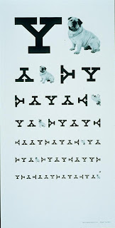
Paul Rand, (designed the logo for abc) among other work, created two pieces involving eye charts that I found were very interesting. The first is the Blurred Eye Chart and the second (1988) was a recruitment poster for Yale University. I believe that both examples relate to Visual Communication and Typography. These designs show both repetition to create balance with the letterforms and continuation as both ask your eyes to move down through the piece. Scale, symmetry and proximity are also very important components of the eye chart as the letters are sized and placed near or in correspondence to each other in both compositions.


The last photo is an photo of design I pass every day on my way to school. It is an example of the design principle of alignment as well as positive/negative with the shape cut out on the top right of the green square showing the brown underneath.

Monday, August 31, 2009

Ganatomy


Given the anatomical assignment, I chose to create two new drawings rather than using my previous compositions which I felt were too crowded for clear labeling. However, I kept Futura and Bodoni as my typeface choices. I felt that these compositions were fairly clear in regard to the points being labeled. Despite this, the bar on the Bodoni "g" indicating the "X-Height" distracts from the "g" and appears to falsely indicate another letterform. Also, "Counter-Space" should just be labeled "Counter."