This past semester in Visual Communications I have developed an icon set based on my original story of "Saturday Morning" that included an; alarm clock, hairbrush, mirror, hand weights, toothpaste, pillow, vitamins and a tea cup. Initially, I felt like my icons needed to have a more organic feel that would communicate a leisurely morning where a woman has the time to drink a cup of tea, work out, etc... This led to multiple hand-drawn revisions, both for accurate proportions as well as communication of the object (Ex/ My coffee cup was changed to a tea cup). These drawings were then vectored and adjusted digitally. My first couple color choices for the set resulted in dull colors that didn't accurately express my story but were changed in the final version to a lighter, calm and feminine colors. From this point, my icons were the base of collecting data to communicate through an information graphic. My two strongest ideas were location and numerical based that incorporated my tea cup and pillow. These were then put into the magazine spreads from Typography 2 that further emphasized the article. After this, my icons were used to create harmonious and amplified pattern that were used to create comparative compositions using my icons and text that used the principles of either anchor or relay to emphasize and change their meanings. From these comparisons, a system was created that was then spread across a set of materials for a Smithsonian museum exhibit entitled, "Myth Truth: a Dialogue of Household Superstitions."
It is difficult to accurately express all that I have learned throughout the semester. Within each phase of the project, there were times when I felt like I wasn't "getting it". This required me to work through each through a different means than what I began with. Sometimes this meant going back to thumbnails or reviewing my process completely. I've found that a problem could usually be solved by returning to (and beginning with) hand-drawn sketches or even lists to develop, create, or strengthen a design and organize my thought process in a visual way. After the finalization of my icon set, I was not as enthusiastic as I wanted to be with including them across different designs or materials. However, after more icon adjustments/corrections both the info-graphics and (in the end) my museum exhibit have been influenced and strengthened by their use (Ex/ I have used a similar color palette that I enjoy throughout each project to emphasize my story). Also, I have learned the importance of added (and needed) elements to stregthen a design aside from vectored image and text such as those used in my tea information graphic background.
 Final Materials Presented at Critique Wednesday 05/05/2010(Revisions will be posted this weekend)


 ______________________Linear Progression: Pattern iterations were created with my icon set based on the principles of harmonious and amplified pattern. I enjoyed finding connections within my icons and creating the compositions. The simple pattern with legible icons worked well with some of my compositions.


Word Bank of Anchorage and Relay ideas that include combining image and text to change or emphasize the meaning of my icons.

Two compositions that later developed into two of my three final directions: Superstitions and Body Image

I had difficulty at this point of the project with using the compositions I had created across a set of materials. Here are a few examples of different compositions of the two directions shown above that incorporate pattern, text and imagery to explain each concept.


After a few rounds of iterations, I focused on the "Superstition" idea with the title, Myth Truth: a Dialogue of Household Superstitions. From this point, I worked with attempting to communicate somewhat arbitrary and complex superstitions through imagery and text.
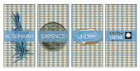
 The final materials will incorporate pattern with image like those seen with the web banner from critique on Wednesday.______________________Icon Combination: Using images to anchor the superstitions that, If a girl puts rosemary and sixpence under her pillow at night she will see the face of her future husband in a dream, I incorporated "pillowed" pattern into the background and placed the centered band over with text to explain the superstition. This rule is transferred to other materials to make a cohesive set of materials that communicate the theme of my exhibit, superstition as well as formally incorporate my icon set, pattern and text. This uses harmonious pattern as well as anchorage with icons and images.

This combination includes a broken glass photograph and 7 icon mirrors are placed anchors the superstition that If you break a mirror you will have 7 years of bad luck.  Using harmonious pattern of my hairbrush icon and an image of hair the superstition that, If you brush your hair 111 times in one day you or someone very close to you will die, is anchored through both the imagery and the text that explains the myth.


 Monogram Layout


 ______________________


 The final materials will incorporate pattern with image like those seen with the web banner from critique on Wednesday.
 Using harmonious pattern of my hairbrush icon and an image of hair the superstition that, If you brush your hair 111 times in one day you or someone very close to you will die, is anchored through both the imagery and the text that explains the myth.


