Showing posts with label Typography 2. Show all posts
Tuesday, May 11, 2010
Monday, May 10, 2010
Marian Banjtes Poster

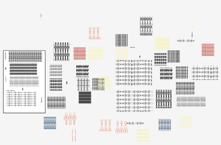
This poster proved to be a big challenge for me. Because I really admire Marian Banjtes work, finding a solution that embodies her style combined with my own was a process that I should continue until I resolve it in a better way. My final that I showed in final review includes pattern made from calligraphic marks that I combined and colored. From this, I chose to include the pattern in the title, "Risk Is In The Details." Because I included the pattern in some of the text, legibility is still an issue in regards to the short, average "poster glance". I do like the direction that I ended up printing, however it still needs refinement both in the text, composition and maybe color. I wish that I would have been able to find this direction a week earlier. With this, I have been able to explore creating pattern and how it combines with text. Hopefully, this edition is more like me and less weak attempts at Marian Banjtes. Perhaps with more time and refinement, one of initial ideas would be possible--maybe a summer project?
Process of poster ideas:
Working on color combination:
Process of poster ideas:
Working on color combination:
Sunday, May 9, 2010
Thursday, May 6, 2010
Final Review Proposal
Final Review List:
Visual Communications:
Books: Dot, Line (Print out specific juxtapositions?), Haiku Taxonomy, Info-graphic Spread (Print out separate info-graphics?), Museum Exhibit
Animation: Haiku
Process: Haiku/Taxonomy, Icon Set (Info-graphic/Museum Exhibit)
Print: Line Juxtapositions, Info-Graphics [?]
Typography:
Print: Monogram Layout, Change One Thing Poster, Weather Billboards, Magazine Layout, Marian Bantjes Poster
Animation: Weather
Process: Weather (Type Experimentation Photographs), Change One Thing Poster
Color, Drawing & Form:
Books: Color Book (Shoe Photographs)
Image Making:
Books: 7 Deadly Sins
Print: Amelia Earhart Poster, 6 Degree Poster & DVD set (shared with Brandon)
Other Project Possibilities:
Color, Drawing & Form: "X" Manipulated Letter-form?
Image Making: Book Covers?
Type:Process on Magazine Layouts?
First Direction:
Express my interest in typography as well as print work that communicates through specific audiences (Using my magazine layouts and posters) as well as a brief interest in photography and experimentation (using my color book, deadly sins book and weather billboards).
________________
Second Direction:
I would like to discuss my interest in typography, pattern and concept.
Typography will be referenced in my magazine layouts and Change One Thing poster. The Change One Thing poster will include process from initial concept with the AIGA competition to the poster shown in the Steve Frykholm critique and then the final submitted and spread throughout Kansas City (shown in context). Spreading across classes with my magazine spreads, I will discuss how I handled typography within my info-graphics as well as the line book from first semester.
Pattern will be included through an overview of my Line book from first semester (with selected juxtapositions printed larger and hung on the wall) in addition to the recent Museum Exhibit and Marian Banjtes Poster. Within this I will talk about the formal qualities of including pattern and how it relates to images and text within a composition as well as conceptual levels within both the exhibit and line compositions that used principles (like anchorage and relay) to create deeper meaning in specific compositions that compliment my design.
My last subject will include a brief overview of the conceptual base for many of my projects shown specifically through my color and 7 deadly sins books. How I am influenced in photography and how I have learned from the process of creating specific compositions rather than arbitrary photographs that can form relationships to type and other design elements.
Edit & Print:
Change One Thing Poster
Magazine Layouts
Information Graphics
Line Book (one)
Specific juxtaposition compositions
Museum Exhibit Booklets and Materials
Things to include during my presentation:
What I have learned spread across classes and semesters
"For example..."
Visual Communications:
Books: Dot, Line (Print out specific juxtapositions?), Haiku Taxonomy, Info-graphic Spread (Print out separate info-graphics?), Museum Exhibit
Animation: Haiku
Process: Haiku/Taxonomy, Icon Set (Info-graphic/Museum Exhibit)
Print: Line Juxtapositions, Info-Graphics [?]
Typography:
Print: Monogram Layout, Change One Thing Poster, Weather Billboards, Magazine Layout, Marian Bantjes Poster
Animation: Weather
Process: Weather (Type Experimentation Photographs), Change One Thing Poster
Color, Drawing & Form:
Books: Color Book (Shoe Photographs)
Image Making:
Books: 7 Deadly Sins
Print: Amelia Earhart Poster, 6 Degree Poster & DVD set (shared with Brandon)
Other Project Possibilities:
Color, Drawing & Form: "X" Manipulated Letter-form?
Image Making: Book Covers?
Type:Process on Magazine Layouts?
First Direction:
Express my interest in typography as well as print work that communicates through specific audiences (Using my magazine layouts and posters) as well as a brief interest in photography and experimentation (using my color book, deadly sins book and weather billboards).
________________
Second Direction:
I would like to discuss my interest in typography, pattern and concept.
Typography will be referenced in my magazine layouts and Change One Thing poster. The Change One Thing poster will include process from initial concept with the AIGA competition to the poster shown in the Steve Frykholm critique and then the final submitted and spread throughout Kansas City (shown in context). Spreading across classes with my magazine spreads, I will discuss how I handled typography within my info-graphics as well as the line book from first semester.
Pattern will be included through an overview of my Line book from first semester (with selected juxtapositions printed larger and hung on the wall) in addition to the recent Museum Exhibit and Marian Banjtes Poster. Within this I will talk about the formal qualities of including pattern and how it relates to images and text within a composition as well as conceptual levels within both the exhibit and line compositions that used principles (like anchorage and relay) to create deeper meaning in specific compositions that compliment my design.
My last subject will include a brief overview of the conceptual base for many of my projects shown specifically through my color and 7 deadly sins books. How I am influenced in photography and how I have learned from the process of creating specific compositions rather than arbitrary photographs that can form relationships to type and other design elements.
Edit & Print:
Change One Thing Poster
Magazine Layouts
Information Graphics
Line Book (one)
Specific juxtaposition compositions
Museum Exhibit Booklets and Materials
Things to include during my presentation:
What I have learned spread across classes and semesters
"For example..."
Dot Book

Line Book


Haiku Taxonomy (Include Process)


Haiku Animation

Info-graphic Spread (Include Icon Process)


Museum Exhibit (Include Icon Process)


Monogram Layout

Change One Thing Poster (Include Process)


Weather Billboards/Animation (Include Process of Experimentation Photography)


Magazine Layout


Marian Bantjes Poster

Color Book

7 Deadly Sins

Amelia Earhart Poster

6 Degree Poster & DVD
Line Book


Haiku Taxonomy (Include Process)


Haiku Animation

Info-graphic Spread (Include Icon Process)


Museum Exhibit (Include Icon Process)


Monogram Layout
Change One Thing Poster (Include Process)


Weather Billboards/Animation (Include Process of Experimentation Photography)


Magazine Layout


Marian Bantjes Poster

Color Book

7 Deadly Sins

Amelia Earhart Poster

6 Degree Poster & DVD

Monday, May 3, 2010
Bantjes Poster:03
Subscribe to:
Posts (Atom)